Live Challenge closes on the 13th of October 2026

Live Challenge closes on the 13th of October 2026

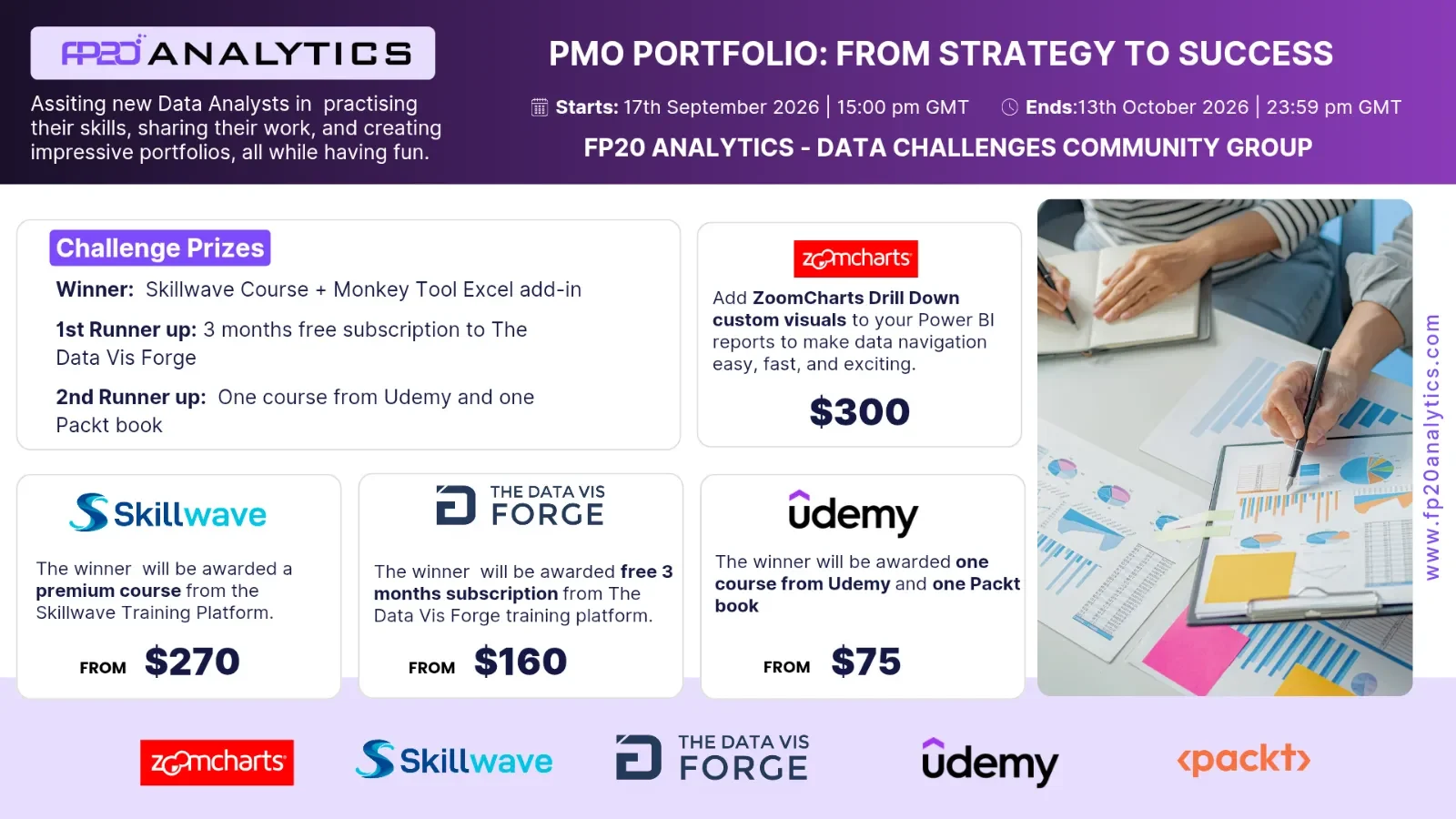
Participate in the ZoomCharts Challenge to showcase skills, gain recognition, network, and boost your professional profile.
The ZoomCharts team provides personalized feedback to EVERY report entry that meets the requirements. This gives all participants the chance to hone their skills and adjust their report before deadline, giving you an extra competitive edge in the challenge.
Upon signing up for the challenge, you will receive a FREE Drill Down Visuals Developers License that lets you access the full Drill Down Visuals PRO library. This license remains active for a year after the last challenge you take part in. Meaning, you can access the latest advanced data visualization tools to enhance your projects for a full year.
Participants receive all the latest information on upcoming workshops and events, demonstrating how our team of proven professionals approaches visualizing the given dataset for the challenge. You also have the chance to book 1:1 calls with a Power BI mentor who will analyse and give specific suggestions to improve your report.
Last but not least, entering the challenge with ZoomCharts puts you in the running for an additional $300 Amazon gift card.

Below is your show time. Read me carefully!
Below is your important reading!
Welcome to FP20 Analytics Challenge 41: PMO Portfolio – From Strategy to Success, where analytics meets portfolio management, project delivery, strategic investment and business value realisation.
In this challenge, you will step into the role of a PMO Analyst, Portfolio Performance Manager, Transformation Consultant or Executive Strategy Advisor, tasked with evaluating the health and value of a complex project portfolio.
You are not simply comparing projects—you are telling the story of how schedule performance, cost variance, milestone delivery, resource capacity, risk exposure and benefit realisation influence portfolio outcomes. The best submissions will connect these measures to strategic priorities and practical management decisions.
The objective is clear: transform the data into actionable portfolio intelligence—highlighting which projects are delivering the greatest value, which require recovery plans, where resource constraints or unresolved risks threaten delivery, and where continued investment may no longer be justified.
Your final recommendations should help decision-makers determine which projects to accelerate, recover, pause or terminate, while balancing delivery performance, strategic importance, available capacity and expected benefits.
This challenge is an opportunity to demonstrate how Power BI can turn complex PMO information into a clear, engaging and evidence-based portfolio strategy.
1. How has overall portfolio performance changed over time, and which trends require leadership attention?
2. Which programmes, business units or locations show the greatest variation in project performance?
3. Which measures show the strongest improvement or decline?
4. Where are the largest schedule delays, cost overruns or delivery inefficiencies?
5. Which programmes, business units or project categories explain the biggest differences in performance?
6. How do key delivery metrics compare across strategic themes, methodologies and priority levels?
7. Are there any outliers or unusual project patterns that require further investigation?
8. Which factors appear most closely connected to better or worse project outcomes?
9. Where are the strongest opportunities for operational or portfolio improvement?
10. What practical recommendations should leaders prioritise based on the data?
11. Which projects are delivering the greatest expected value relative to their approved budget?
12. Where are resource-capacity gaps affecting project progress and milestone delivery?
13. Which projects have the highest risk exposure, and are their mitigation actions being completed on time?
14. Which projects are failing to realise their planned benefits despite appearing financially or operationally healthy?
15. Based on strategic value, delivery performance, risk and benefits, which projects should be accelerated, recovered, paused or terminated?
Know more about the judging criteria and other requirements
1. Is too much text used for explanation?
2. Are the indicative colors in charts understandable?
3. Does it tell a story?
1. Cross-chart filtering implementation.
2. Across the report. Can other visuals provide relevant data as the user explores the rep.
3. Response time.
4. Drill Down: multi-layer data exploration. Can the user drill down and gain additional insights within the report?
5. Use of tutorial overlays and other elements to assist new users. Can a new user start using this report straight away with just the guidance provided within the report itself?
1. Visual design: is the overall look consistent, no empty spaces, no overcrowding?
2. Interface design: are there unnecessary visualisations, buttons, complexity in use?
3. UX design: is the produced report usable?
4. Report design: is the main challenge answered?
5. Technical: are all the fonts used the same, are the sizes readable?
All tools are permitted for the challenge.
For the ZoomCharts Challenge, create a Power BI report that includes at least 2 ZoomCharts Drill Down Visuals on one report page.
Reports are restricted to a maximum of three pages, including drill-through pages.
Canvas size is 16:9 (Default Power BI size) or Full HD size = w:1920 - h:1080.
Business users use reports to make data-driven decisions. Reports are effective if they enable users to drill down and filter data quickly and intuitively to find answers to any question they might have and analyse data in all possible directions and dimensions.
1. Use-Case Gallery: Try live demos and download reports made by the ZoomCharts team
2. Video tutorials: Watch engaging video guides on how to set up and use the visuals
3. Documentation: Technical deep-dive about ZoomCharts visuals
4. ZoomCharts Blog: Useful tips & tricks for data visualization and report creation
5. Visuals Gallery: Explore all the possible customization options for Drill Down Visuals.
1. One Excel workbooks.
2. One Word document containing the Introduction and Brief (English).
3. Challenge Timeline
To submit your three-page report, please follow these steps, if you want to be considered for the ZoomCharts' prize, otherwise post your entry in the challenges group.
Your report must be verified to ensure it meets all the technical requirements. If the report is validated, you will receive a 'Publish to Web' link. If it does not meet the criteria, you will receive a rejection reason and will have the opportunity to resubmit your report.
1. Upload the report as a PDF document on your LinkedIn feed.
2. Use the caption "I am participating in FP20 Analytics Challenge 41” and screenshots from your report.
3. Include a summary of your report's key insights.
4. Use the hashtags #FP20Analytics, #FP20PMOPortfolio, #builtwithzoomcharts, tag @Federico Pastor - @Zoomcharts
5. Additionally, post your report in the FP20 Analytics LinkedIn Community Group.
Click on the link below to get your dataset: The files contain all the necessary data and information to create your report.